The colors for spring 2016? Has it already been a year? Yes, and we've reached the usual appointment with the guide. colors 2016, which, according to Pantone, will be the must-haves this spring and, as always, I love observing them, thinking about them, meditating on them and… telling you something about them and maybe suggesting some ideas for using the colours proposed by Pantone in more or less traditional ways.
When I have to define my work it is not easy, I am an eclectic and varied creative, my job is not only to create "beauty", but also to discover and research new trends in the field installations, on topic wedding and all the facets of creativity. I surf the internet, but not too much; I prefer reading, looking at shop windows, buildings, exhibitions, or magazines. This year, too, I've shaped and consolidated my opinion regarding the 2016 trends: that the 2016 Pantone colors will very often be paired with two diametrically opposed materials: metallic and precious materials such as bronze, silver, copper, stone, and gold, or extremely natural materials such as wood, bark, and stone.
Now a roundup of the Pantone colors 2016Thanks to Pinterest, my girls and I had fun creating an inspiration board for each color. We hope you find them useful!
This year, we'll all be seeing light but bold colors. Let's look at them one by one.
ROSE QUARTZ
Nicknamed by Pantone “The Color Of The Year”, has already invaded the New York runways. A spring-like and certainly delicate shade, inspired by rose quartz, it expresses tranquility and composure. This color, combined with Serenity, certainly releases a sense of serenity and tranquility.

PEACH ECHO
Already in fashion for several seasons, it maintains its place of honor among the colors in vogue in 2016. peach eco It is part of the shades of orange, so it is considered a warm color that can be combined with more intense colors such as Fiesta which we will see later.

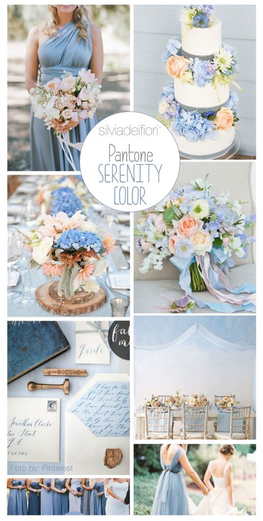
SERENITY
A particular shade between blue and light blue, it is a very pale and light color and, as the name suggests, it is a color that instills tranquility and is reminiscent of the summer sky.
It's an extremely spring-like and summery color, but also, as its name suggests, one of extreme serenity. This color helps us distance ourselves from the emotional and physical stress of everyday life.

SNORKEL BLUE
A decidedly bolder, extremely elegant color, it's perfect for weddings or very important events. It's part of the maritime blue family.

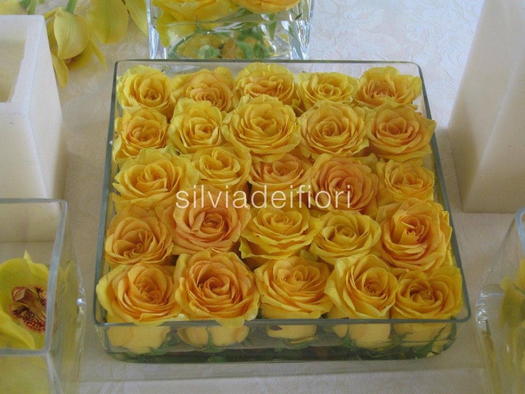
BUTTERCUP
A deep yellow shade reminiscent of warm butter, perfect for hot summer days. Paired with a soft gray, it's truly striking without dazzling your guests.

LIMPET SHELL
It's a shade somewhere between light blue and aquamarine. It's a fresh color that conveys tranquility. Ideal for beach weddings!

LILAC GREY
Neutral color that Pantone has decided to include in the color palette 2016. The Lilac grey It's a unique shade of gray, and can be paired with any color to create truly unique compositions. It's also perfect for weddings or winter events.

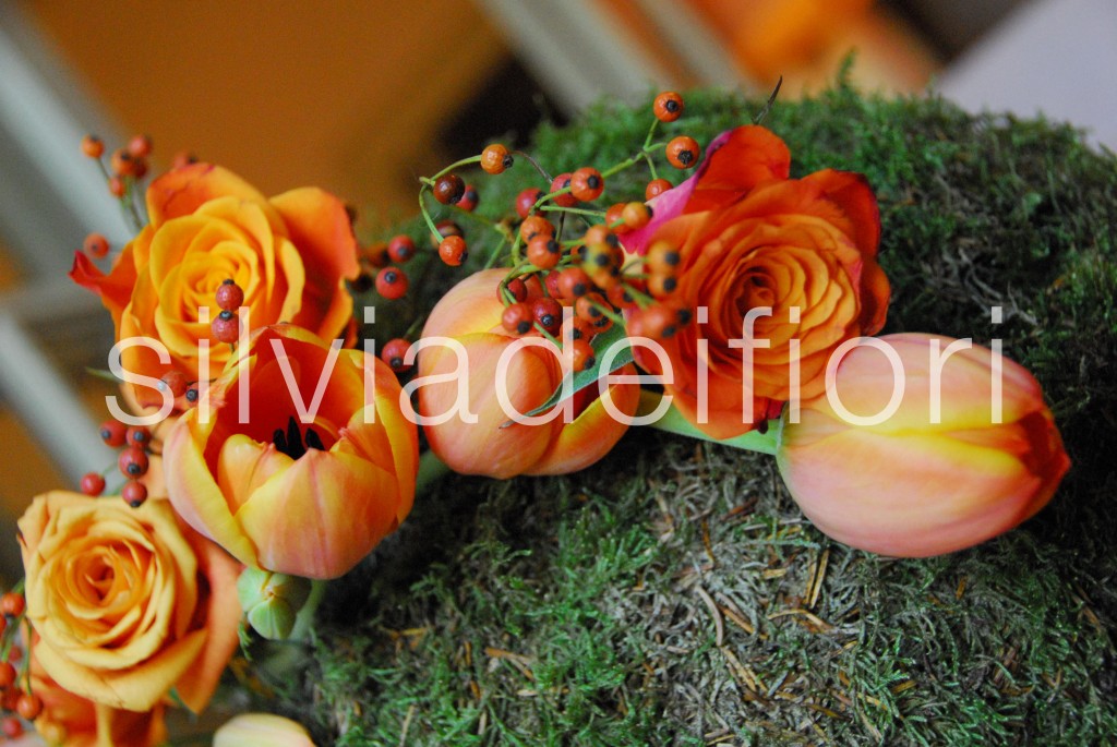
FIESTA
Here's the true star of this wonderful color palette! A warm, bright tone that invites you to dare, expressing passion and vitality. It's a color that contrasts completely with the others, which are certainly more muted. This color is very versatile because, as we'll see below, it can pair with any color and shine above them all.

ICED COFFEE
Basic or neutral color not like the Lilac Grey, which will surely accompany us also in the spring-autumn season. It is considered a real passepartout. Suitable as always for weddings in country style.

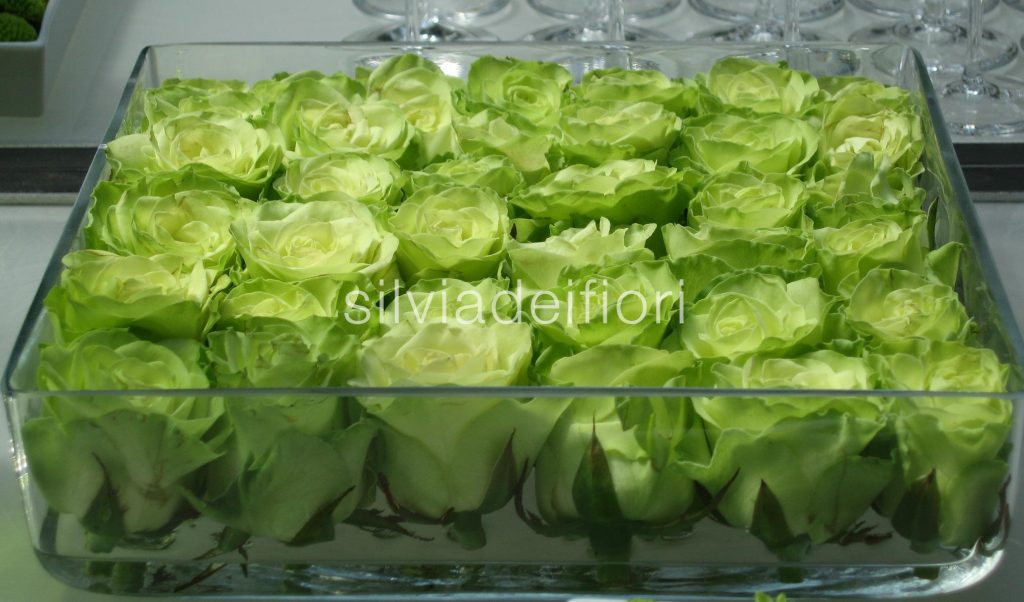
GREEN FLASH
A bright color that inspires boldness. This color is perfect for weddings that want to stand out while remaining completely respectful of nature. It evokes natural landscapes with a strong personality.

Finally, flowers, Pantone always leaves us speechless! But it's up to us, with our creativity and good taste, to measure, calibrate, and combine these fantastic colors.
As already written above, this fantastic color palette It will be strengthened thanks to the combination of precious or natural materials that will give it even more body, but be careful not to overdo it, as in all things less is more.
My favorite color for 2016? I'll have to think about it a bit more...but I promise I'll tell you very soon!